Before & After: Our Mid-Century Nursery Reveal!
Mmmmm, this room is special. The verrrrry first time we ever stepped foot in this house on the showing, adam and I both instantly called this room “the nursery” without even thinking about it.
It wasn’t “just” a bedroom, we instantly KNEW this would be the room of our future littles. We could just picture kiddos in this home– specifically in this room.
This bedroom is snuggled in right next to the master bedroom (easy access for middle-of-the-night feeds!), and has such peaceful energy to it– warm wood paneling, great natural light, awesome size... its location, size, and the vibe seemed like the perfect place for our kiddos to be “someday”.
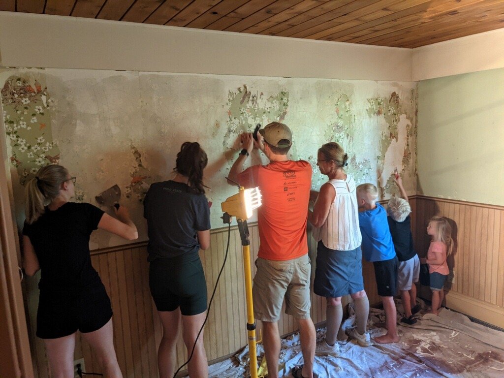
When we moved in, the walls were covered with a sailboat wallpaper… annnnnnnd approximately 3 other wallpaper layers beneath it (photo below of SEVEN people working to remove the impossible layers, ha!). After removing the wallpaper, we tentatively just painted it white and used it as a guest bedroom until the day we needed it for a little one…
Fast forward, and we decided to start trying for our family a few months later– and suddenly our “someday” nursery felt a lot more real!
moving in:
getting through the final layers of wallpaper was a TEAM effort! It felt like there was an additional layer of wallpaper for each decade this house has existed, ha!
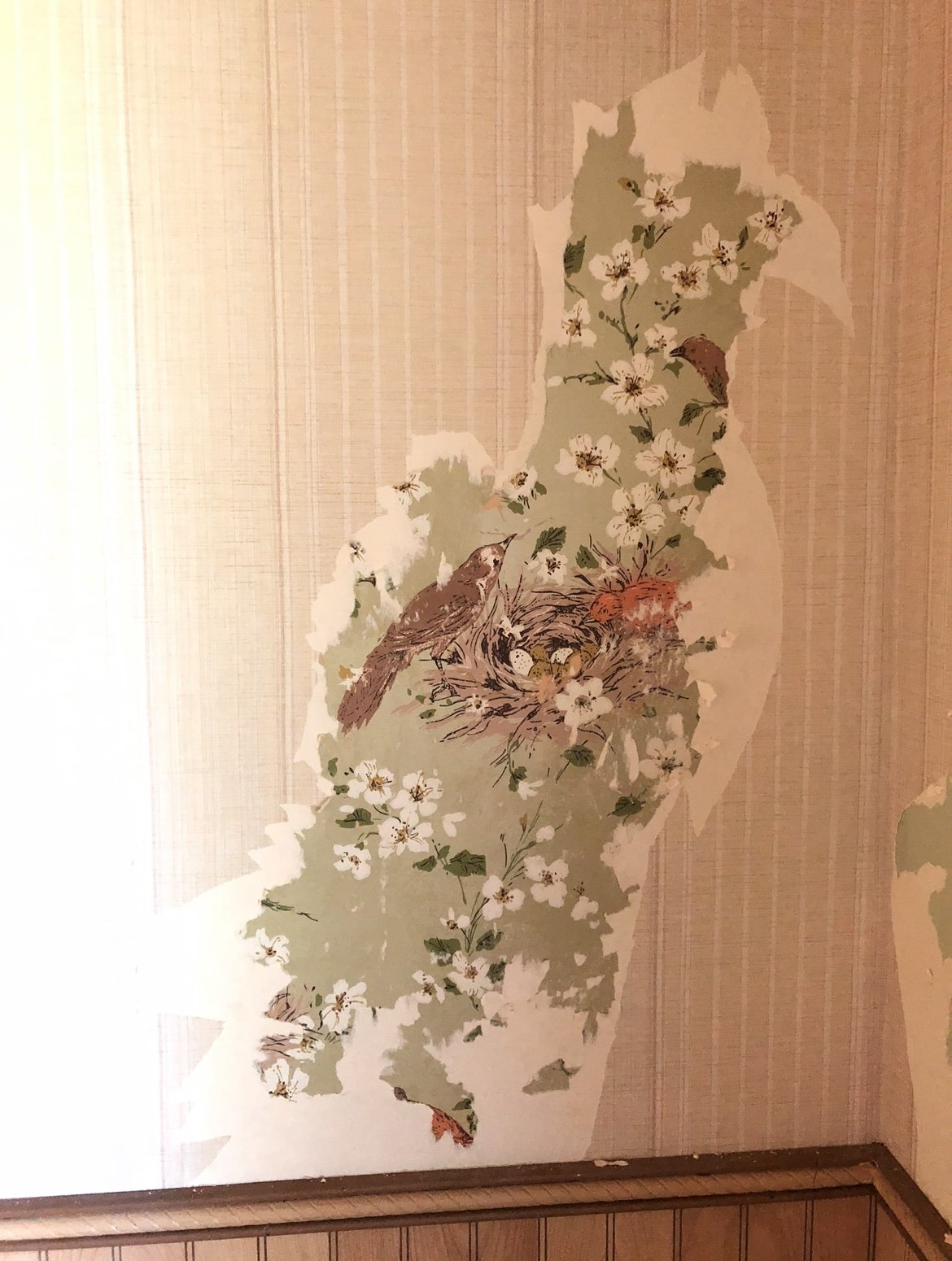
peeling back decades of wallpaper. We LOVED this bird one, but unfortunately, we weren’t able to maintain it enough to keep it. :( It was the last layer so we estimate it is from the 60’s!
designing it:
During pregnancy, I had SO much fun designing the nursery… I knew I wanted something that was mostly gender-neutral, had a lot of plants & greenery, and a playful, fun energy!
but (foreshadowing…) it didn’t turn out AT ALL how I expected!
I changed the design of this room so many times…
I made designs with bold wallpaper
….without bold wallpaper
I made designs with the wood paneling
…without the wood paneling
With bold paint color
…without bold paint colors
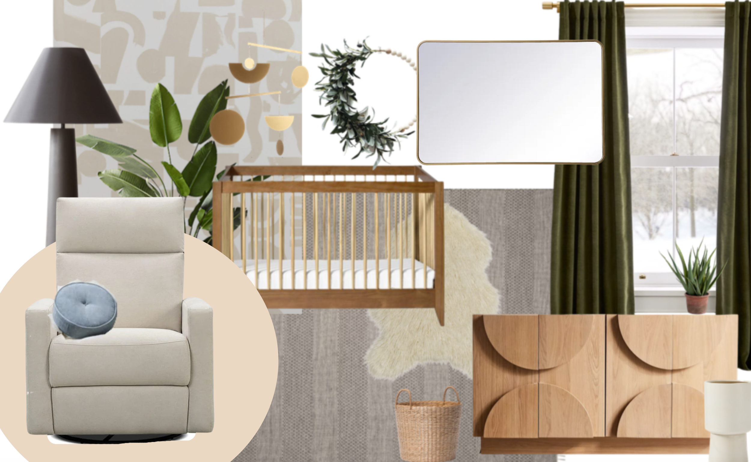
Ultimately, I decided to wallpaper the whole dang room with this gorgeous option! I LOVED this print and was ready to commit. Here is a peek at a “mood board” made for the nursery of my original vision– bold wallpaper, deep greens, wood accents… At times, this design felt a bit “busy” to me in some ways and I questioned my design, but I honestly thought it would be a really bold & playful approach to a nursery design in our quirky mid-century! I was so excited!
for every room I design, I always make a mood board :) this was my original design and intention for this room…….. but, ultimately, we ended up NOT going with the wallpaper (although I still love it!)
….annnnd changing my mind
… But when adam and I went to install the wallpaper, it just didn’t feel right. Should we do a half-wall of wallpaper? Paint the paneling? Remove the paneling altogether? Full-wall wallpaper? Half?
No matter what option we considered, we just couldn’t envision it once we actually saw it in the space…
Because, the truth is… we liked the room as is.
…Like, a lot.
It almost felt like we were putting the wallpaper up solely to “do something new” for the nursery...but did we need to? Did we actually want to?
After A LOT of back and forth and instagram polls (...IYKYK), we became open to keeping the wood paneling as is (we could always paint or add wallpaper later on, if we wanted!). We ultimately put the wallpaper away, and decided to keep the room very neutral while bringing in visual interest through art, texture, and unique furniture shapes :)
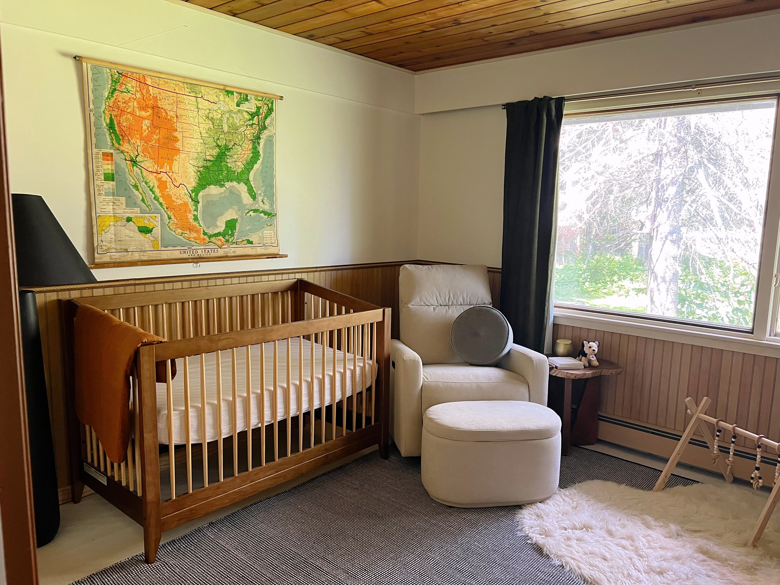
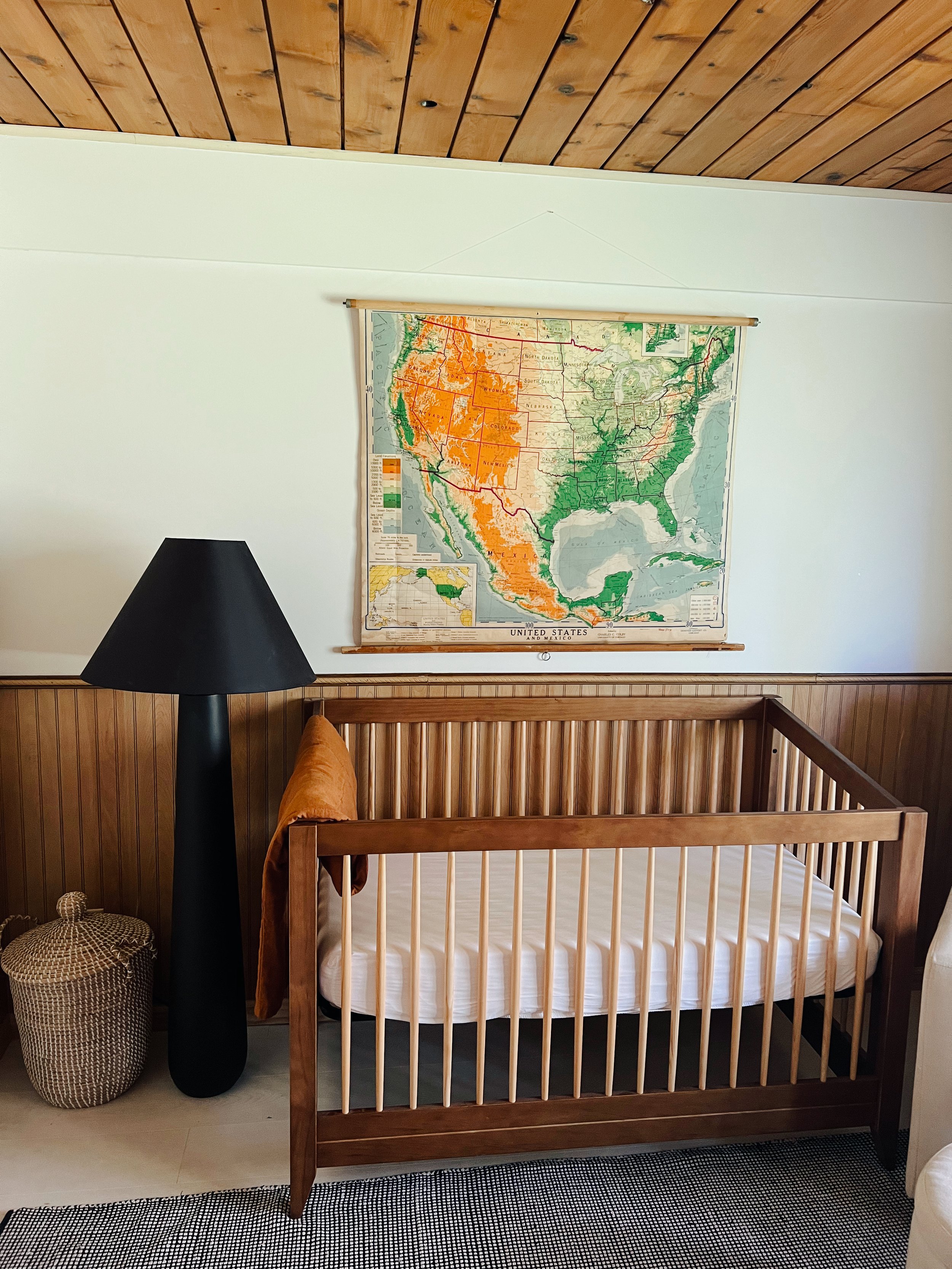
The result? A cozy, wood-filled, bright, neutral nursery. It’s simple, VERY affordable (becacuse we hardly changed anything!), and such a serene place to snuggle lil Miles. We wanted to keep a somewhat “vintage” mid-century vibe, but make it modern (and give us the option to change & update it as the years come along!). I am sure this room will evolve, but we love how it looks right now!
before photo:
the house when we toured it :)
after
(ALL links are shared at the bottom!)
i tried to bring fun shapes into the space through the furniture and decor :)
maps & cribs & wood paneling
love the layering of rugs for some extra texture!
my 3 favorite things in the nursery:
1) THE NURTURE& GLIDER:
Trust me— this is the glider of your dreams. It’s from from Nurture&, and they shared a coupon for ya! Enter FOUNDATION50 to save some money on your glider :)
Hands down my favorite place in the nursery– this cozy chair in the corner. A place to nurse & cuddle & read & snuggle! While there are many “fine” gliders out there, we knew we wanted one that was great. Knowing that we will be spending hours & hours & hours in this exact spot (not only with this kid, but our future little ones too!), we felt that investing in a quality, comfortable glider option was important to us.
I kept doing research on different gliders, but couldn’t find one that I felt super confident in– either it was very cute (but not functional), functional (…but ugly), overly expensive (and long shipping times), orrrr cheap quality. Let’s be real— picking a glider is a HARD purchase! It’s a financial investment, not easy to return if you don’t like it, you don’t know how it’ll feel, etc. etc. etc.
…..Fast forward, Nurture& reached out to me, and it felt #MeantToBe. I honestly had never heard of the brand, but once I read about their mission and quality, I instantly knew we had found “it”.
Ultimately, this glider WAS gifted to us (eeee! Thank you, nurture&!). And while this is one of the first big “gifted” things I’ve ever accepted as a blogger, I prooooomise, this is my genuine review. Trust me when I say— this. glider. is. amazing.
Here’s the summary–
A gorgeous design that functions (this combo is unfortunately SO rare to find!)
Extra tall back that allows for back and head/neck support (amazing for relaxing and lounging back while you snuggle and supporting proper ergonomics)
Rocks and swivels and has a power recline (AKA, a unicorn)
Meets (and exceeds) ASTM Safety Standards by being made with non-toxic materials
Prop 65 compliant, TB117-2013 and UFAC, and TSCA Title VI compliant (this just means that the chairs meet very rigorous standards for being made of safe, nontoxic materials)
has a USB charging port built-in (amazing for charging your phone on those late-night feeds!)
Does not use any fire retardant chemicals (yessss! SO. rare.)
Free shipping (alleluia) and a 30-day risk-free trial
…..annnnd, most importantly, I really just can’t even emphasize how comfy it is
It’s like sitting on a cloud…. but, like, a cloud that has amazing head/back support & automatic recliners, & an extra-wide sitting space, and just SO. COMFY. I am not kidding when I say any friend or family member who has sat in it says “holy crap, this thing is comfortable”.
A glider is definitely an investment piece, but when you consider all the hours we’ll be sitting there breastfeeding, rocking our little one, reading to our child, it is definitely a place you want to feel COMFORTABLE and have a quality item. We are genuinely obsessed with our glider, and can’t imagine a more comfy [nontoxic!] place to snuggle our little!!! (just read the reviews on the website and you’ll see what I mean….)
Also, this is NOT sponsored and I didn’t “have” to brag about this brand. I genuinely wanted to share because I know picking a glider is overwhelming & I couldn’t recommend this one any more highly. (Bonus— Nurture& was nice enough to give a coupon for foundation blog readers! Enter FOUNDATION50 to save some moolah!)
2) THE CRIB:
Mmmmm, this crib. I saw this online and instantly knew it was “the one”. I LOVED the two-tone wood that matches both the dark walnut wood in our house and the lighter pine found on the ceiling of this room. I feel that it really fits our mid-century vibe, but in a modern, timeless way– and it converts to 4 different styles of bed so that it can grow with baby. I looooooove our crib, and definitely recommend it!
3) THE MAP:
This. MAP. I feel like it MAKES the room. I love the unique colors, vintage energy, and large size. I found it on facebook marketplace from a retired teacher and scored it for $40. The map is from the 50’s and was HUGE when we got it. I actually trimmed it down substantially in order for it to fit on the wall. But I love love love the beautiful blues, greens, and oranges in this map— it’s playful & childish, while still being polished. I love the vintage & colorful vibes it brings to the room!
links to all items:
Rocker chair: Nurture& (coupon:FOUNDATION50)
Ottoman: Nurture& (coupon:FOUNDATION50)
“Dresser”: Urban Outfitters (we already owned this, and I love it in this space!)
Storage containers (in dresser): Container Shop
Light fixture: Anthropologie (not installed yet)
The wallpaper we almost used: Lulu & Georgia
gold mobile / light catcher: sun electric
Light Blue Circle Pillow: Lulu & Georgia
Map print: FB marketplace used
Plant: Home Depot
Peep the mini stuffed animal dog that my Grandpa Ron gave us for Miles (He got it from the AARP catalog…*happy tears*)
There ya have it— our nursery! Is it the most ~dramatic~ transformation? no, no, it’s not!
And, I’ll admit, at times, I regret not making a more drastic change with paint, wallpaper, etc., buuuuuut it honestly was a great reminder to me that I don’t always have to “do” a lot with home design!
Sometimes just a change in decor & art can change the entire vibe of a room— and just working with what you have is a great option :) I love how simple, warm, and welcoming this room is. We are so grateful to have this sweet spot for Mr. Miles!
Just like the layers of wallpaper that welcomed us in this space, I am sure we will go through several renditions of this room in the years to come— and this as the “first” version feels quite special!





Another monthly round-up is here! 8 specific (and random) items I used & loved in February! From my go-to wine subscription (for over 5 years), Miles’ baby book, an #aesthetic candle lighter, and more— there’s some GOOD stuff in here!